(PCM) You would think that when a large banner type sign gets placed in front of your building, someone maybe, just maybe might want to take a few moments to go out a take a look at it to make sure that everything is okay. Especially if that building happens to be a church and the sign you just hung up appears to promote atheism rather than the church itself. The image below was posted by Reddit user,GODDOGGODDOGGOD
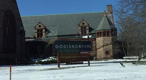
We are fairly certain that the sign pictured above was supposed to read “God Is Now Here” however because of poor spacing and design execution on the banner it instead reads something more similar to “God Is Nowhere” or as Reddit users prefer “God I Snow Here”. Either way, somewhere along the way the message got lost in translation and the internet is having a field day making fun of the poorly spaced sign.
This is not the first time that signs with poor spacing have hilariously circulated the web. Here are few other examples below (seriously, some of these people need to be fired)
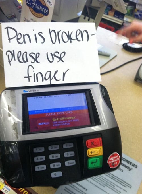
Hmm … just what kind of machine is this anyway? Oh, wait! Pen! They mean a writing utensil … now we get it!
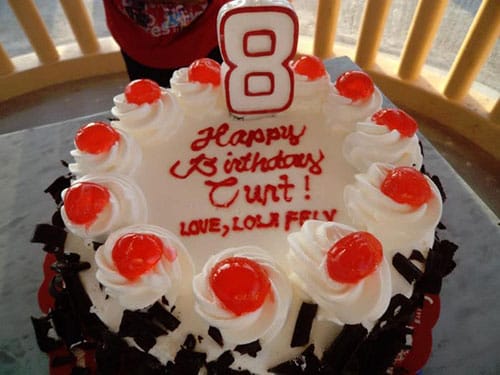
Let’s hope that poor “Curt” has many many more Happy Birthday’s to come!

Is this a “special” kind of juice? They might want to rethink the font choice!